Consistent Branding in Web Design

Branding isn't just about a logo or tagline—it’s about creating a consistent identity that people recognize and trust. When it comes to web design, this consistency becomes even more important. A cohesive look and feel across your website ensures visitors know who you are and what you stand for. It builds credibility, fosters loyalty, and makes your brand memorable. In a world where people jump from screen to screen, making your site unmistakably "you" is key to standing out and staying relevant.

The Importance of Consistent Branding

Consistency in branding is more than just keeping a logo in the same spot—it’s about ensuring every element of your web design reinforces who you are as a business. When done right, it creates a seamless experience for users, fosters deeper trust, and can even help your site perform better in search results. Let’s break down why consistent branding matters and how it strengthens your web presence.

Building Trust and Recognition
Humans are wired to trust what feels familiar. When your branding looks the same across your website—from logo placement to color schemes and typography—it signals reliability and professionalism. Think about it: if you visited a website where the colors and fonts kept changing, wouldn’t it feel chaotic and untrustworthy?

Consistent visuals and messaging ensure people recognize your brand instantly. This familiarity fosters a strong connection, making users more likely to return. Whether it’s the tone in your copy, the placement of your logo, or the style of your imagery, keeping everything uniform creates a cohesive identity. Over time, this consistency builds an emotional connection, turning first-time visitors into loyal customers.

Enhancing User Experience
Good branding isn’t just about aesthetics; it’s about usability. When the design is predictable, users can navigate with ease.
Imagine walking into a grocery store where products are randomly placed—you’d feel frustrated, right? The same applies to websites.

A unified design ensures that elements like navigation menus, buttons, and calls-to-action are easy to locate. Users can process information faster when they don’t need to reorient themselves on every page. Consistency in branding also reduces decision fatigue by framing content in a way that feels intuitive. The result? Visitors stay longer, interact more, and leave with a positive impression.
Core Elements of Branding in Web Design

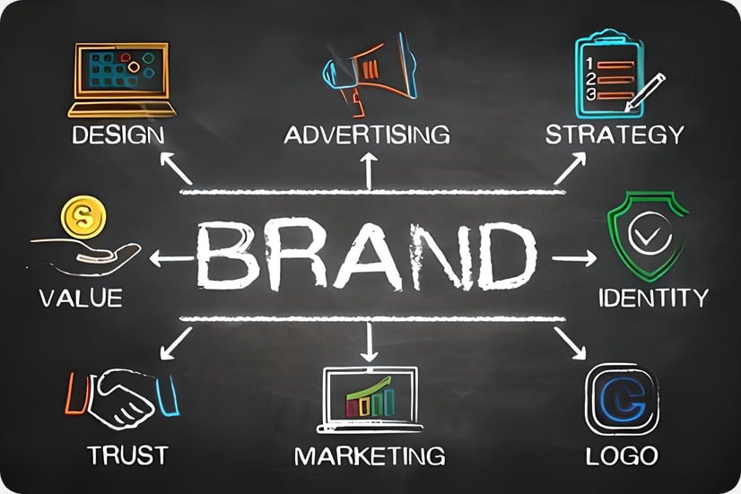
Branding in web design goes beyond aesthetics—it's about shaping how visitors feel and interact with your brand. Strong branding creates a seamless and memorable experience from colors to typography, tone to imagery. Each piece has a role to play, working together to tell your brand's story. Let’s take a closer look at the core elements of branding in web design and how they ensure a unified experience.

Visual Identity: Logo, Color Palette, and Typography
Your brand's visual identity is its first impression. The logo, color palette, and typography should work together to express your brand's personality and values.

  • Logo: 
    Your logo acts as the cornerstone of your visual identity. On your website, it should appear in strategic locations, like the header or footer, ensuring it's instantly recognizable. Keep its placement consistent to build familiarity, no matter what page the user lands on.
  • Color Palette:
    Colors evoke emotions. Blue conveys trust, green suggests growth, and red grabs attention. The right color palette not only represents your brand but sets the mood for your website. Use your chosen colors consistently—backgrounds, buttons, and link styles should all reflect them.
  • Typography:
    Fonts are more than just letters; they communicate tone. A modern sans-serif font might suggest a tech-forward company, while a serif font feels traditional and trustworthy. Stick to no more than two or three typefaces, and use them consistently for headings, body text, and calls-to-action. Consistency here reinforces your professionalism and makes your content readable.

Together, these elements create a cohesive look that users instantly associate with your brand.

Imagery and Iconography

The visuals on your site—images, illustrations, and icons—say as much about your brand as words do. They create an emotional connection and tell your story in ways that text sometimes can't.

Here’s how typography impacts web design:

  • Choose images that align with your brand:
    If you're a high-end fashion brand, polished, professional photos set the tone. If you're a local bakery, real-life, warm imagery of fresh pastries might feel more authentic. Decide what matches your brand and stick with it. Avoid stock images that feel generic or overly staged—they can harm authenticity.
  • Icons should serve a purpose:
    Icons might seem like small details, but they play a big role in usability. Choose a style that matches your brand—minimalist, hand-drawn, or bold—and apply it throughout the website. For instance, if your site uses flat, modern icons, don’t mix in shaded, overly stylized ones.
  • Consistency is key: 
    Make sure your imagery has a unified aesthetic—similar filters, lighting, or compositions across photos. When it comes to iconography, stick to a single set or style to avoid clashing visuals.

By thoughtfully crafting your site’s imagery and iconography, you create a visually seamless experience that communicates who you are at a glance.

Every element, from photos to fonts, logos to language, serves as a building block of your brand. When they all align, your website becomes a clear reflection of your identity, leaving a lasting impression on every visitor.

© Copyright 1999- Bantas Creek Productions . All Rights Reserved.